Reduce Ecommerce Bounce Rate with 19 Personalization Tips
Written by The Kickflip Team
April 4th, 2024
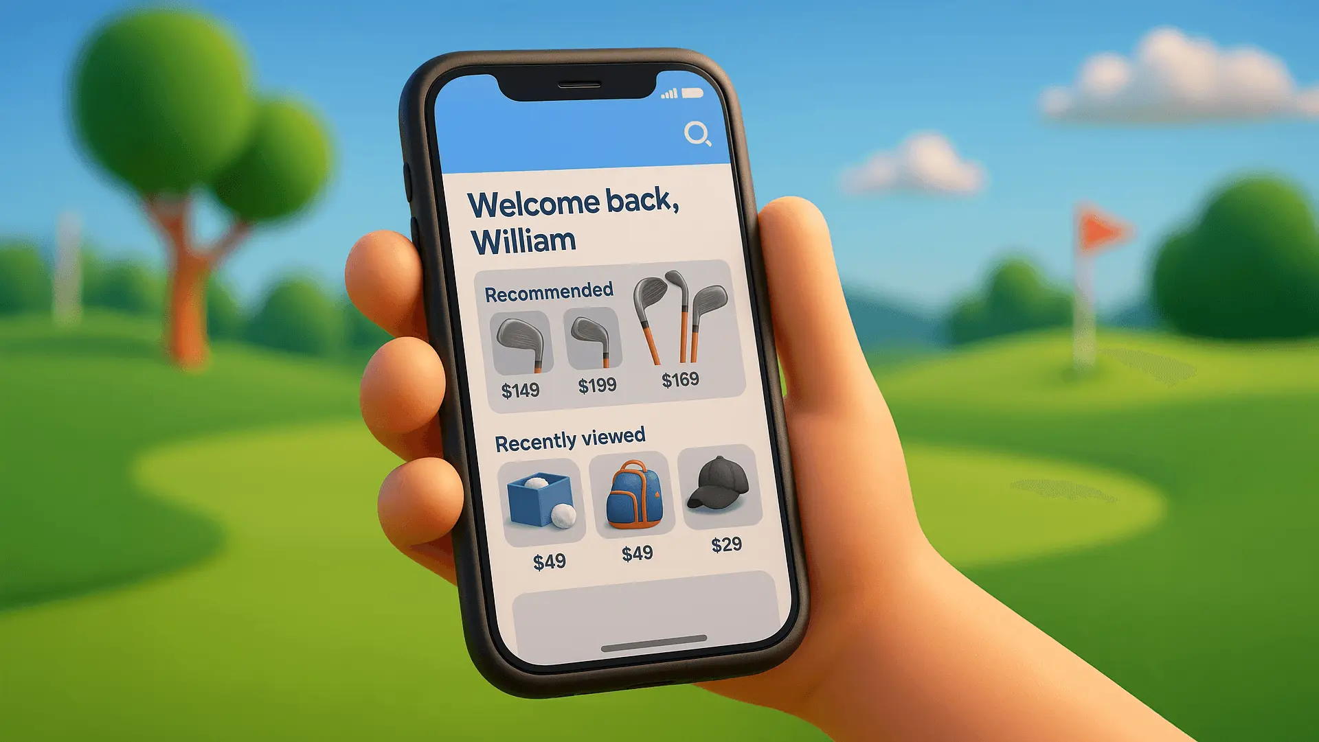
Table Of Contents
When someone visits your ecommerce site and leaves without clicking anything else — that’s a bounce.
According to Google Analytics, it’s called a single-page session. And it’s a silent killer of conversions.
Why?
Because high bounce rates usually mean your site didn’t feel relevant, trustworthy, or engaging enough to make them stick around.
In other words, you had traffic… but no traction.
The fix? Personalization.
From dynamic homepages to tailored product recommandations, personalization gives your visitors exactly what they’re looking for — before they click away.
In this post, you’ll learn 19 powerful personalization tactics (with examples) that help you reduce bounce rate, keep visitors engaged, and drive more sales.
Let’s get into it.
What Causes High Bounce Rates in Ecommerce?
Before we fix bounce rate, we need to understand what’s causing it.
Here’s what sends visitors running for the back button:
Slow page load times
Nobody waits. If your site takes more than 3 seconds to load, it’s game over.Confusing layout or poor user experience — including technical issues like cluttered pages, awkward navigation, or hard-to-read fonts — all lead to instant bounce.
On the flip side, a well-designed interface with intuitive navigation and fast load times encourages potential customers to stay, engage, and convert.Irrelevant landing pages
If someone clicks a Google ad for “custom mugs” and lands on your homepage… that’s a disconnect.Too many choices
The “paradox of choice” is real. Overwhelm kills action.No clear path to conversion
If users don’t know what to do next, they won’t do anything at all.
Here’s the truth most brands miss:
The problem isn’t traffic — it’s relevance.
You can spend all day buying clicks.
But if your store doesn’t immediately connect with each site visitor’s intent, you’re wasting money and momentum.
That’s exactly where personalization comes in.
When your store adapts to who’s visiting — what they care about, where they came from, and what they’ve seen before — bounce rate drops and conversion rates climb.
How Personalization Helps Reduce Bounce Rate
Here’s why most ecommerce business websites bounce visitors:
Here’s why most ecommerce websites bounce visitors:
They treat every visitor the same.
But today’s shoppers expect more.
According to a 2023 survey conducted by Deloitte Digital, nearly 70% of consumers say they are more likely to purchase from a brand that personalizes experiences.
So if your home page, product pages, and navigation feel generic? They’re gone.
Personalization flips the script.
It uses:
Dynamic content (like recommended products or tailored headlines)
Customer intent (based on referral source, device, or behavior)
Behavioral data (browsing history, cart activity, search terms)
…to create a shopping experience that feels relevant — even familiar.
When your site adapts in real time to the individual, they stick around.
And the longer they stay, the more likely they are to convert.
Bottom line?
Personalization turns bounce into engagement. And engagement into sales.
Up next: 19 personalization tactics you can start using today to keep visitors on your site longer — and turn more of them into customers.
19 Personalization Tactics to Reduce Ecommerce Bounce Rate
A. On-Site Experience Personalization
Make your website instantly relevant by adapting what each visitor sees the moment they land.
1. Personalized Homepage
Most ecommerce homepages try to speak to everyone — and end up connecting with no one.
That’s a bounce waiting to happen.
Here’s a better approach: Turn your homepage into a welcome-back experience.
When a returning visitor lands on your site, personalize the homepage based on:
Their name or account
Recently viewed products
Previously browsed categories
Saved preferences
This immediately creates familiarity and relevance — two bounce rate killers.
🛍 Real-World Example: Amazon
Ever notice how Amazon never shows you a generic homepage?
Instead, it greets you by name and serves up a curated homepage based on:
Items you’ve recently browsed
Past purchases and reorder suggestions
Personalized deals
Trending in your location
“Customers like you also bought…”
This isn’t just helpful — it’s addictive. And it’s a big reason why a lot of people don’t bounce from Amazon. They explore, scroll, and click deeper.
2. Personalized Navigation Menus
Your nav menu is prime real estate.
But most ecommerce stores waste it with the same static links for everyone — even returning visitors.
Here’s how to fix that:
Make your navigation menu dynamic based on user behavior.
When someone returns to your site, show them:
Categories they browsed previously
Recently viewed or saved products
Top picks based on their shopping habits
A “Continue where you left off” link
This small tweak makes it faster for users to find what they care about — and keeps them from bouncing out of frustration or decision fatigue.
🛍 Real-World Example: Amazon (Again)
Amazon’s “Your Browsing History” and dynamic “Departments” section in the nav is always changing based on what you looked at last.
If you recently browsed outdoor gear, that category floats to the top.
If you’ve been hunting for books, it’s front and center.
The result? Less friction. More clicks. Lower bounce.
3. Dynamic Product Recommendations
Once a visitor starts browsing, your job is to keep them exploring.
And the best way to do that?
Serve up product recommendations that actually make sense.
Forget generic “Best Sellers” carousels that show the same items to everyone.
Instead, tailor your recommendations using:
Browsing behavior (what they’ve clicked or favorited)
Purchase history (repeat orders, saved items)
Trending data (what’s hot in their region or category)
Customer similarity (what similar users are interacting with)
Done right, dynamic recommendations are an excellent way to transform your pages into personalized discovery engines.
🛍 Real-World Example: Etsy
Etsy doesn’t just recommend products — it curates based on your taste.
Browse handmade mugs once, and next time you’ll see local finds, matching sets, and shop suggestions tailored to your vibe.
That relevance keeps users scrolling instead of bouncing.
4. Recently Viewed Items Carousel
Most visitors don’t buy on their first visit and when they come back, they’re often hit with a blank slate.
A “Recently Viewed” carousel helps them pick up right where they left off.
It’s familiar. It’s frictionless. And it saves them from having to dig through categories or search again.
Even better — it builds momentum toward purchase.
🛍 Real-World Example: Nordstrom
Nordstrom keeps a “Your recent views” section pinned to the bottom of the homepage and product pages.
It makes re-browsing feel effortless — and reminds visitors what caught their eye.
5. Smart Search Results
If your search bar shows the same results to everyone, you’re missing an easy win.
Smart site search functionality adapts to what the user wants — before they even finish typing.
Think autocomplete with brains.
It pulls from:
Recent searches
Browsing behavior
Purchase history
Popular queries in their region
This makes the experience feel tailored — and way faster.
🛍 Real-World Example: Sephora
Sephora’s search suggests relevant products and categories based on your skin type, past purchases, and preferences — not just best sellers.
6. Personalized Product Page Messaging
Your product page is where visitors decide to stay… or bounce.
So don’t just show the product.
Speak to them — based on what you know.
Personalized messaging can include:
“You viewed this last week — it’s still in stock.”
“Only 2 left in your size.”
“Pairs well with the [product] in your cart.”
“Shipped fast to [City Name]”
These micro-messages increase relevance and build urgency — without overwhelming the user.
🛍 Real-World Example: ASOS
ASOS adapts product messaging based on size availability, user location, and browsing history.
You’ll often see alerts like “Selling fast” or “Almost gone in your size” — all tailored to your data.
7. Geolocation-Based Content
If your site treats a shopper from New York the same as one from Sydney, you’re doing personalization wrong.
Geolocation lets you tailor content, currency, and copy based on where your visitor is.
This is an easy way to make the experience feel local — and relevant — right from the start.
Show:
Prices in local currency
Region-specific shipping times or promos
Local inventory or best-sellers
🛍 Real-World Example: Wayfair
Wayfair uses geolocation to surface trending items by region and tailors delivery estimates based on your zip code — directly on the product page.
8. Weather-Based Personalization
Weather affects what people buy more than you think.
Use real-time weather data to personalize product displays, banners, and promotions.
If it’s raining in Vancouver, show waterproof boots. If it’s 90°F in Miami, push sunglasses and swimwear.
This kind of micro-personalization taps into immediate needs — and that reduces bounce.
🛍 Real-World Example: Very.co.uk
This UK fashion retailer integrates local weather patterns into its personalization efforts. Based on a user’s location, Very highlights products suitable for the current weather, enhancing user engagement.
B. Behavioral & Exit-Intent Personalization
Use real-time behavior to trigger personalized experiences before visitors click away.
9. Exit-Intent Popups with Smart Offers
When a visitor’s about to leave, you’ve got one last shot to keep them engaged.
Exit-intent popups give you that final moment — but they need to feel personalized.
How does it work?
Most tools detect exit intent by tracking behavior like:
The mouse moving quickly toward the top of the screen (to close the tab or hit “Back”)
Inactivity after scrolling
On mobile devices: rapid upward scrolling or swiping toward the browser bar
This gives you a short window to re-engage the visitor — but generic popups won’t cut it.
Instead, personalize your exit message based on:
The product they viewed
What’s in their cart
Their time on site or scroll depth
Whether they’re new or returning
🛍 Real-World Example: Brooklinen
Brooklinen tailors its exit popups to the visitor’s journey.
For example:
If you were browsing sheets, the popup might say:
“Your dream bed is just one click away — here’s 10% off to help you sleep better.”
10. Personalized Overlays for Returning Visitors
Most ecommerce sites treat returning visitors like strangers.
That’s a missed opportunity.
A personalized overlay can pick up the conversation where it left off — and push them to convert.
Use overlays to:
Acknowledge return visits (“Welcome back!”)
Reference previously viewed or saved items
Offer incentives tied to past interest (e.g. “Still thinking about this mug? Here’s 10% off.”)
These overlays work best when they’re subtle, relevant, and timed — not intrusive.
🛍 Real-World Example: Blenders Eyewear
Blenders triggers returning-visitor overlays that say things like:
“Still eyeing those shades? Here’s 15% off to make it official.”
11. Dynamic Chat Invites
Live chat is great — but smart chat is even better.
Trigger chat invites based on user context — like cart contents, browsing behavior, or inactivity.
For example:
If someone’s idle on the cart page, prompt them with: “Questions about shipping or returns?”
If they’re viewing a customizable product: “Need help finishing your design?”
The goal? Make the invite feel contextual, not robotic.
🛍 Real-World Example: Allbirds
Allbirds launches proactive chat prompts when users hover too long on a sizing guide or cart page.
The invite? A friendly nudge: “Not sure about your fit? We’ve got you.”
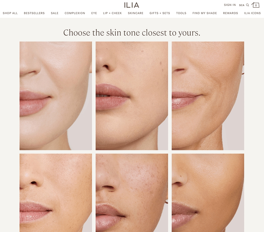
12. On-Site Product Quizzes & Guided Flows
Visitors who don’t know what to choose often leave without clicking anything.
A short, personalized quiz keeps them engaged — and guides them to the right product.
Think of it as a digital salesperson:
Ask 3–5 quick questions to understand their needs, then recommend tailored products or categories.
Popular quiz types:
“Find your perfect fit”
“Which [product] is right for you?”
“Build your bundle in 60 seconds”
The key? Show results that feel specific — not generic — based on their answers.
🛍 Real-World Example: ILIA Beauty
ILIA offers a “Find Your Shade” quiz that asks about skin tone, undertone, and coverage preference — then recommends a matching foundation. It’s simple, fast, and effective.
C. Email & Retargeting Personalization
While these channels don’t reduce bounce rate during the first visit, they help bring visitors back with more relevant offers — lowering bounce on return sessions and re-engaging lost traffic.
13. Personalized Cart Abandonment Emails
Someone added a product to their cart… then disappeared.
A personalized cart abandonment email gives them a timely nudge — with exactly what they left behind.
These emails work best when they include:
A photo and name of the abandoned product
A sense of urgency (“Only 2 left in stock”)
A clear CTA (“Return to your cart”)
Optional incentive for first-time customers
The more it mirrors the user’s intent, the higher the chance they’ll take the next step to return and convert.
🛍 Real-World Example: Casper
Casper’s abandoned cart emails include the exact mattress you left behind, a quick reminder of their risk-free trial, and a subtle urgency push:
“Still thinking it over? We’ll hold it for you — but not for long.”
It’s low-pressure, but highly effective.
14. Segment-Based Product Launch or Promo Emails
Blasting the same promo to your entire list? That’s a fast track to unsubscribes — and bounce on return visits.
Segment your email campaigns based on what visitors browsed, bought, or interacted with on your site.
Examples:
If someone browsed hiking gear → announce your new trail shoe launch
If they bought mugs → send curated ceramic collections or accessories
Personalized promos feel relevant — and that drives opens, clicks, and return visits that actually stick.
🛍 Real-World Example: Huckberry
Huckberry sends product drops and deals tailored to the collections you shop most. If you’ve shown interest in watches, you’ll hear about watch launches — not flannels.
15. Personalized Win-Back Campaigns
Not every bounce happens in one session — some happen over time.
Personalized win-back emails re-engage inactive visitors by showing them what they’ve missed.
Instead of “We miss you,” try:
“Here’s what’s new in [the category they browsed]”
“Still interested in [product type]? It’s back in stock.”
“Other shoppers like you just bought these…”
The goal is to re-spark interest with personalized highlights — not generic discounts.
🛍 Real-World Example: True Classic
True Classic sends win-back emails based on browsing categories (e.g. tees, polos) and gently reintroduces products with soft CTAs like:
“Back in your size — just in time for summer.”
It’s personal, timely, and drives meaningful return traffic.
D. Customization & Design Experience
Let users shape their own experience with interactive tools that keep them engaged and invested.
16. Personalized products
Giving shoppers the power to design their own product isn’t just cool — it’s a bounce rate killer.
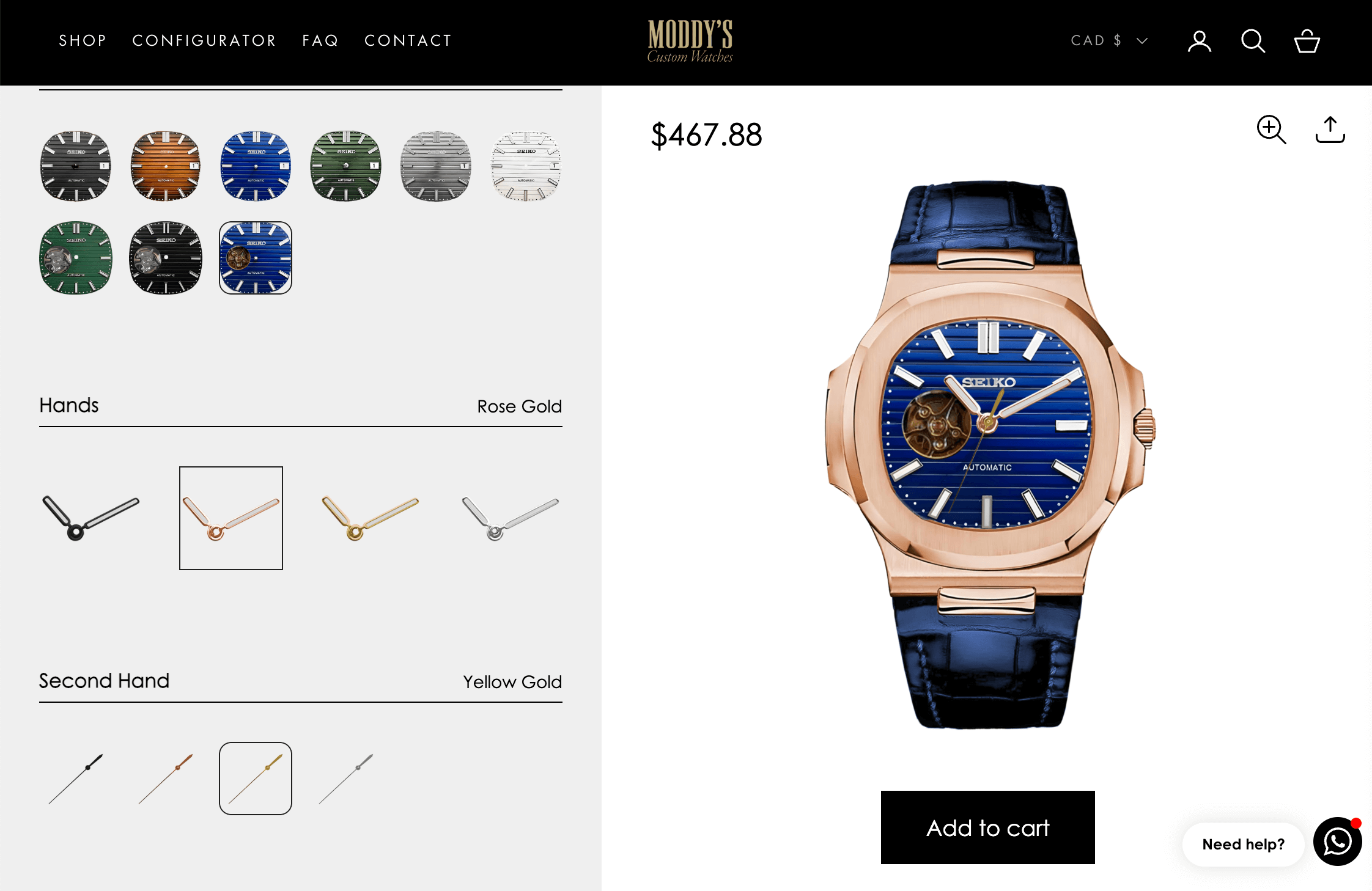
When users can interact, customize, and see real-time previews, they stay longer — and are more likely to convert.
This tactic shines in categories where:
Personal taste drives the purchase (e.g. apparel, gifts, shoes)
Visualizing the end result builds confidence
The product is meant to feel personal, unique, or made-to-order
🛍 Real-World Example: Kickflip
Brands using Kickflip let customers personalize everything — from shoes and watches to bags and gaming controllers — right on the product page.
Users can:
Upload logos
Add names or messages
Choose colors, patterns, and extras
See instant visual updates
It’s fun, immersive, and a great way to increase time on web pages.
E. Trust & Social Proof Personalization
Boost confidence and reduce bounce by showing the right reviews and signals to the right people.
17. Save and Resume Design Progress
Creating a personalized product takes time — and sometimes, website visitors just aren’t ready to finish in one session.
Letting users save their progress and return later turns bounce risk into re-engagement opportunity.
Without this feature, every exit is a dead end. With it, users can pause — and pick up exactly where they left off.
🛍 Real-World Example: Kickflip
Kickflip-powered stores let users save and share their in-progress designs with a simple link — no login required.
They can paste it into a note, send it to a friend, and come back to it later.
18. Dynamic Social Proof
Visitors want to know they’re not the only ones interested in your product.
Real-time, location-aware social proof builds trust and urgency — fast.
Examples include:
“12 people from [city] bought this in the last 24 hours”
“4 others are viewing this right now”
“Bestseller in [user’s region]”
These micro-signals validate the product’s popularity and relevance to the shopper.
🛍 Real-World Example: Booking.com
While not ecommerce in the traditional sense, Booking.com nails this with phrases like:
“This property was booked 3 times in the last 6 hours.”
19. Show Reviews Relevant to the User
Most shoppers don’t care what everyone thinks — they care what people like them think.
Use personalization to surface the most relevant reviews based on user profile, location, or selected product variant.
Examples:
Filter reviews to show only the size or style the user selected
Prioritize feedback from nearby regions or similar demographics
Highlight photos or videos that match the visitor’s preferences
🛍 Real-World Example: Nike
Nike shows “Top reviews for your size and fit” — filtering based on your selected options.
It helps customers make better decisions and increases confidence in the purchase.
The result? Less hesitation, more clicks, lower average bounce rate.
FAQs
What is a good bounce rate for ecommerce?
A good bounce rate for ecommerce typically falls between 20% and 45%. Rates above 55% may indicate issues with relevance, usability, or performance — especially on product or category pages.
How does personalization reduce bounce rate?
Personalization makes your site instantly relevant by adapting content, products, and messages to each visitor’s behavior, preferences, or location — keeping them engaged instead of leaving.
How does personalization help reduce ecommerce bounce rate?
It instantly increases relevance. By showing each visitor tailored content, product suggestions, and experiences, personalization keeps them engaged longer — reducing the chances they’ll leave after just one page.
Does a lower bounce rate mean higher conversions?
Not always — but it’s a strong signal. A low bounce rate shows a lot of visitors are engaging with your site. That gives you more chances to convert them. It’s not a guarantee of sales, but it’s definitely a step in the right direction.
What tools can help with ecommerce personalization?
Popular tools include Kickflip (product customization), Klaviyo (email), Dynamic Yield and Nosto (recommendations), and Justuno or OptiMonk (personalized popups). Each supports different parts of the personalization stack.
Conclusion: Personalization Wins the Battle Against Bounce
Here’s the truth:
Getting traffic isn’t the problem anymore.
Keeping it — that’s the hard part.
And that’s exactly where personalization shines.
When visitors land on your ecommerce site, they’re asking one silent question:
“Is this relevant to me?”
If the answer is yes, they explore. Click. Add to cart. Buy.
If the answer is no — they bounce. Fast.
That’s why personalization isn’t just a conversion tactic.
It’s bounce rate insurance.
By tailoring the homepage, product suggestions, overlays, emails, and even the design experience itself, you’re creating a shopping journey that feels less like a pitch — and more like a curated experience.
And in a world where attention spans are short and choices are infinite, that matters.
So if you’ve been obsessing over SEO, blog posts, social media, ad spend, or traffic generation…
Take a hard look at what’s happening after visitors land.
Because sometimes, the best growth hack isn’t more traffic.
It’s more relevance.
Future reading
Ecommerce Personalization’s Benefits: The Best Practices
Getting Your First Sales When Launching Your Ecommerce
Revolutionizing Ecommerce with Mass Customization: How Kickflip is Leading the Way
Share This article

Written by The Kickflip Team
April 4th, 2024
The Kickflip team is made up of ecommerce specialists, product experts, and engineers behind Kickflip, a product configurator platform for Shopify, WooCommerce, and Wix. Since 2010, we’ve helped thousands of brands scale personalized product experiences, from startups to Fortune 500 companies. On our blog, we share practical insights to help you improve the buying experience and grow your business with product customization.
Maarten Luyckx
Osaka World
The user-friendly interface of Kickflip, combined with excellent customer service, ensured that this project was brought to a successful and beautiful conclusion.
Shopify App Store
May 20, 2021
Marie-Laetitia Rossazza
My Dust Bag
It took me a long time to find the perfect customizer app, and I’m so happy to say that I finally did! Kickflip is truly the best app on the market. The front end and back end are excellent, and the team behind it is incredibly kind and helpful!
Shopify App Store
September 1, 2023
Brad Jurga
All-Star Sporting Goods
Kickflip made everything easy, from designing the builder all the way through launch. We’re designing truly custom equipment for elite baseball players and this platform allows us to have better engagement and excitement around our brand. We’re seeing an instant return.
Shopify App Store
June 16, 2025
Kasper Taylor
CodedInk
My experience with both the product and the support team has been fantastic. The user interface and user experience are excellent. The features are powerful, and the WooCommerce integration is seamless and easy to set up.
G2.com
June 16, 2025
Saber Naceur
Vinylacy
By far, and I truly mean it, the best customizer available on Shopify. It’s easy to understand and manage, offers options for all types of products, and works extremely well. On top of that, it looks beautiful and feels premium. Highly recommended.
Shopify App Store
December 17, 2022
Jesus Guillermo de León Pérez
Dismo
Kickflip is a fantastic tool. It’s super intuitive, easy to use, and packed with capabilities. You don’t have to be an expert or have experience with other products to get started. The support team is also great and very responsive.
Shopify App Store
July 10, 2024
Frieder Urban
Era of Arc
We were looking for an uncomplicated configurator that was quick and easy to set up, offered plenty of design options, and worked reliably with fast loading times. We tested many configurators on the market, and with Kickflip, we found exactly what we needed.
Shopify App Store
October 10, 2024
John Taggart
Jack Harry and Ollie
What a great addition to our business Kickflip has been. It’s been fantastic to offer our customers the ability to personalize their orders. The support has been excellent, and we especially love that the pricing is tied to our success as customers make purchases.
Shopify App Store
May 7, 2021
TJ Garske
The Net Return
Kickflip saves our team a ton of time by eliminating the need to create custom mockups for customers. Customers can build their product themselves and place an order instantly, without any back-and-forth.
G2.com
January 26, 2026
Amin Hasani
CURVD
After extensive research into product customizer tools, we chose Kickflip for many reasons. We don’t like complicating simple tasks for customers, and Kickflip helped us simplify the process and create a seamless customer experience.
Shopify App Store
July 29, 2025