How to Design a Product Page That Converts (With Examples)
Written by Marie Lamonde
April 14th, 2026
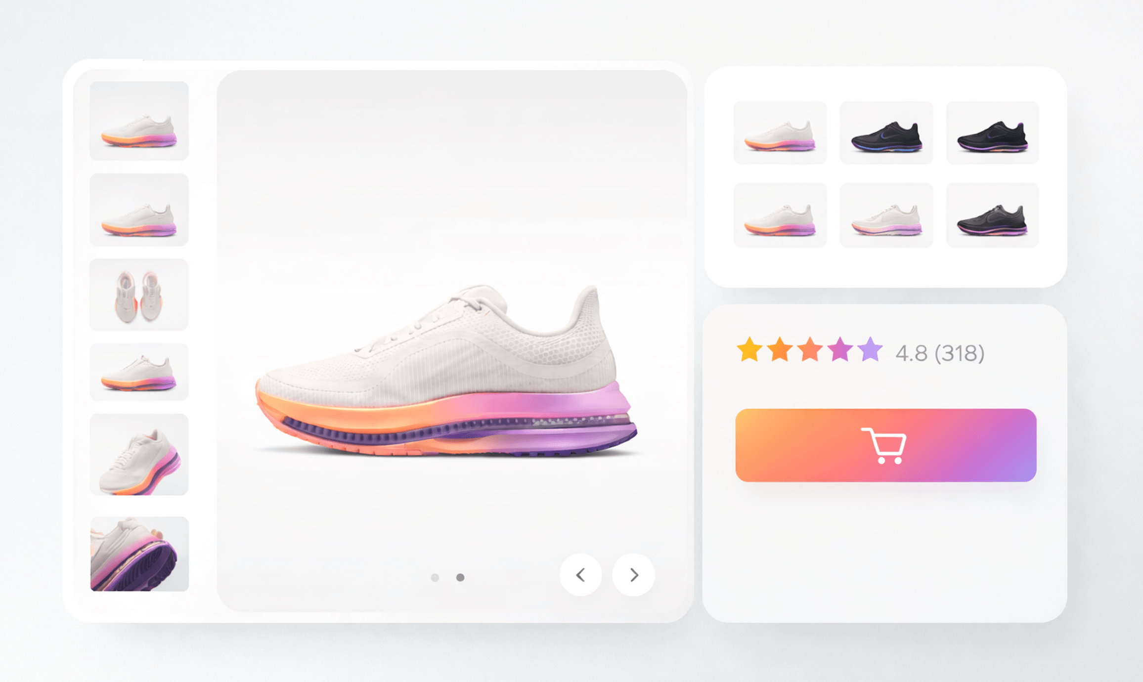
Table Of Contents
Most ecommerce teams do not have a traffic problem. They have a conversion problem.
You can spend thousands driving qualified visitors to your site, but if your product page design does not convert, that traffic goes to waste. The product page is where hesitation turns into action or abandonment. It is the single most important step in the buying journey.
The average ecommerce conversion rate sits between 2% and 4%. That means over 95% of visitors leave without buying. The difference between a mediocre product page and a high-converting one is not subtle. It is revenue.
In this guide, you will learn what effective product page design looks like, why it works, and how top brands structure their pages to convert. You will also see real examples you can learn from and apply immediately.
What Is Product Page Design?
Product page design refers to how a product detail page is structured, written, and visually presented to help users understand a product and feel confident enough to purchase it.
It sits at the bottom of the funnel. This is where users evaluate, compare, and decide.
It is important to distinguish between two types of pages:
A product listing page helps users browse multiple products.
A product detail page focuses on one product and drives conversion.
The Anatomy of a High Converting Product Page
A great product page is not about creativity. It is about clarity, trust, and momentum. Every section should answer a question or remove friction.
1. Hero Section
 (Source: Puma)
The top of your product page does the heavy lifting. Within seconds, users decide if they are in the right place.
A strong hero section includes a clear product name, pricing, a primary image, and a visible call to action. The best pages also highlight a key benefit immediately, not just the product itself.
If users need to scroll to understand what the product does, you are already losing conversions.
2. Product Images and Media
 (Source: Nike)
Users cannot touch or try your product, so visuals must do the work.
High-performing product page design includes multiple images, zoom functionality, and real-life context. Videos and lifestyle imagery increase understanding and reduce uncertainty.
The goal is simple. Replace imagination with certainty.
3. Product Description
 (Source: LARQ bottles)
Most product pages list features. The best ones communicate outcomes.
Instead of saying what the product is, explain what it does for the user. Structure your copy so it is easy to scan. Use short paragraphs and clear sections.
People do not read everything. They look for signals that confirm their decision.
4. Social Proof
 (Source: Old Navy)
Trust is built through other people, not your brand.
Reviews, ratings, testimonials, and user-generated content reduce risk. They answer the question every buyer has in mind. Will this actually work for me?
Without social proof, even a well-designed product page feels incomplete.
Old Navy for example not only has a star rating system displayed on top of the page, it has a whole section dedicated to reviews, you can filter by size, sort by rating, search terms, and see how people overall ranked the fit of the shirt.
5. Pricing, Shipping, and Returns
 (Source: Nike)
Hidden information kills conversions.
Users want to know the full cost, delivery timeline, and return policy before they commit. Transparency removes friction. Ambiguity creates doubt.
Clear communication here often has a bigger impact than design tweaks.
6. Call to Action
 (source: Stanley)
Your call to action should be obvious, visible, and easy to act on.
A strong product page design makes the next step feel natural. The button should stand out visually and appear at key moments throughout the page.
If users have to search for how to buy, they will not.
For example Stanley uses a sticky CTA that follows you when you scroll down the page, so it’s always there whenever you decide to buy along the way.
7. Supporting Elements
 (Source: LARQ bottles)
Additional elements like FAQs, size guides, and recommendations help users finalize their decision.
These sections are not decorative. They are there to eliminate the last objections before purchase.
10 Product Page Design Best Practices
High-converting product pages follow consistent patterns. These are not trends. They are grounded in user behavior.
Clarity always beats creativity. Users should understand the product instantly.
Visuals must do the selling. Invest in high-quality imagery, video or customizers.
Key information should appear above the fold. Do not hide critical details.
Calls to action should be impossible to miss. Visibility drives action.
Reduce friction wherever possible. Fewer steps lead to more conversions.
Social proof should be prominent and credible. It builds confidence quickly.
Mobile optimization is non-negotiable. Most users are on their phones.
Speed matters. Slow pages lose impatient buyers.
Content should be structured for scanning, not reading.
Testing should be ongoing. Small changes can unlock significant gains.
These principles are simple, but execution is where most brands fall short.
How Product Configurators Improve Product Page Performance
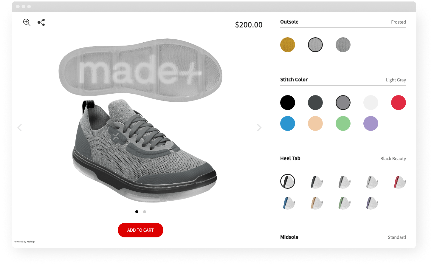
One of the biggest limitations of traditional product page design is that it is static.
Users scroll, read, and imagine. But they do not interact in a meaningful way.
That gap matters, especially for customizable or complex products. When users cannot fully visualize what they are buying, hesitation increases and conversions drop.
This is where product configurators come in.
A product configurator turns your product page into an interactive experience. Instead of choosing from a fixed set of options, users can personalize the product in real time and see exactly what they will receive.
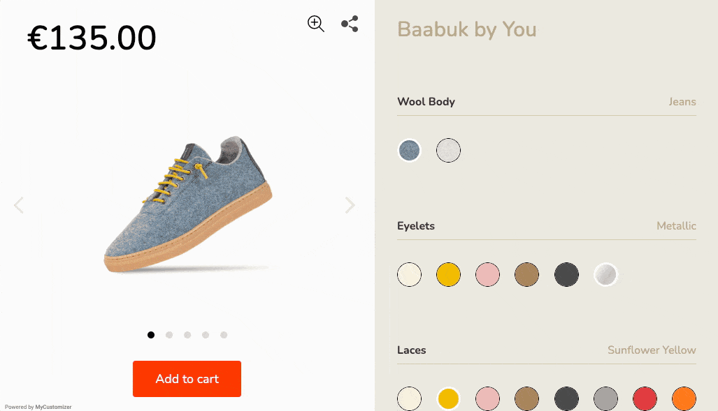
Tools like Kickflip allow users to customize colors, materials, text, and components directly on the product page, with live visual feedback.
This has a direct impact on performance.
First, it increases engagement. Interactive experiences keep users on the page longer, which increases the likelihood of conversion.
Second, it reduces uncertainty. When users can see their exact configuration, they feel more confident in their purchase decision. This is especially important for made-to-order or personalized products.
Third, it increases perceived value. Customization creates a sense of ownership before the purchase even happens. Users are no longer buying a generic product. They are buying something they helped create.
Finally, it simplifies complex choices. Instead of overwhelming users with dropdowns and variant combinations, a configurator guides them through the process step by step.
From a product page design perspective, this shifts your page from being informational to experiential.
Instead of telling users what they can buy, you let them build it.
For brands selling customizable products, this is not just a nice-to-have feature. It is a conversion lever.
When done right, a product configurator does more than improve user experience. It directly impacts revenue by increasing conversion rates, average order value, and customer satisfaction.
Real Product Page Design Examples
Looking at real examples is the fastest way to understand what works.
Below are a few standout approaches and what makes them effective.
Apple
 (Source: Apple)
Apple’s product page design is built on focus.
Each page highlights the product with minimal distractions. The visuals are sharp, the copy is concise, and the layout guides users through a clear narrative.
The lesson is straightforward. When the product is the hero, conversions follow.
Amazon
 (Source: Amazon)
Amazon takes the opposite approach. Its pages are dense with information, yet highly effective.
Reviews, comparisons, FAQs, and detailed specifications are all visible. This reduces uncertainty and answers every possible question upfront.
The takeaway is not to copy the layout, but to understand the principle. More information can convert better when it is structured properly.
Nike
 (Source: Nike)
Nike sells more than products. It sells outcomes.
Its product page design relies heavily on lifestyle imagery and emotional appeal. Users can immediately imagine themselves using the product.
This reinforces a key idea. People buy what a product enables, not just what it is.
Case in point, have you ever seen a shoe get sold with pictures of it being heavily used and dirty? Although unusual, the pictures really sell the purpose of this all-terrain trail running shoe.
Hemmet
 (Source: Hemmet)
Hemmet is an Italian eyewear brand that designs and produces unique and timeless sunglasses, watches, and accessories.
Hemmet's sunglasses can be fully customized to reflect the personality of each individual wearer.
The color, frame, lenses, change everything to make it really your own.
They are creating a unique experience for customers.
BlendJet
 (Source: Blendjet)
BlendJet focuses heavily on trust and reassurance.
Its product pages highlight guarantees, reviews, and benefits clearly. The messaging reduces perceived risk and builds confidence quickly.
This shows how strong positioning and trust signals can elevate even simple product page design.
They also use videos to really show the blender in action, showcasing the product in use, not just static photos.
Common Product Page Design Mistakes
Even small mistakes can have a significant impact on conversions.
Cluttered layouts overwhelm users and make decisions harder.
Weak or hidden calls to action reduce momentum.
Poor mobile experiences frustrate users and increase bounce rates.
Lack of trust signals creates hesitation.
Slow loading times cause users to abandon the page before it fully loads.
Most of these issues are not design problems. They are clarity problems.
Product Page Design Checklist
Before launching or updating a product page, run through a simple mental checklist.
Is the product clear within seconds?
Are visuals high quality and informative?
Does the copy focus on benefits?
Is the call to action visible and compelling?
Are trust signals present?
Is pricing and shipping transparent?
Is the page optimized for mobile?
If any of these are missing, there is an opportunity to improve performance.
Conclusion
Great product page design is not about aesthetics. It is about removing friction at every step.
When users land on your page, they are looking for reasons to say yes. Your job is to eliminate the reasons they might say no.
The brands that win are not the ones with the most traffic. They are the ones that convert it best.
If you focus on clarity, trust, and usability, your product pages will do more than look good. They will drive revenue.
Future reading
Best Product Configurator Software: Expert Guide for Ecommerce, CPQ, and Manufacturing
5 Best-Selling Products We’re Seeing Online (New Data)
Best Shopify Themes for Custom Products: Expert Guide for 2026
Share This article

Written by Marie Lamonde
April 14th, 2026
Marie Lamonde is a Content Marketing Manager at Kickflip with 8 years of experience writing about digital marketing, SaaS, and ecommerce. She specializes in creating clear, search-driven content that attracts, engages, and converts.
Maarten Luyckx
Osaka World
The user-friendly interface of Kickflip, combined with excellent customer service, ensured that this project was brought to a successful and beautiful conclusion.
Shopify App Store
May 20, 2021
Marie-Laetitia Rossazza
My Dust Bag
It took me a long time to find the perfect customizer app, and I’m so happy to say that I finally did! Kickflip is truly the best app on the market. The front end and back end are excellent, and the team behind it is incredibly kind and helpful!
Shopify App Store
September 1, 2023
Brad Jurga
All-Star Sporting Goods
Kickflip made everything easy, from designing the builder all the way through launch. We’re designing truly custom equipment for elite baseball players and this platform allows us to have better engagement and excitement around our brand. We’re seeing an instant return.
Shopify App Store
June 16, 2025
Kasper Taylor
CodedInk
My experience with both the product and the support team has been fantastic. The user interface and user experience are excellent. The features are powerful, and the WooCommerce integration is seamless and easy to set up.
G2.com
June 16, 2025
Saber Naceur
Vinylacy
By far, and I truly mean it, the best customizer available on Shopify. It’s easy to understand and manage, offers options for all types of products, and works extremely well. On top of that, it looks beautiful and feels premium. Highly recommended.
Shopify App Store
December 17, 2022
Jesus Guillermo de León Pérez
Dismo
Kickflip is a fantastic tool. It’s super intuitive, easy to use, and packed with capabilities. You don’t have to be an expert or have experience with other products to get started. The support team is also great and very responsive.
Shopify App Store
July 10, 2024
Frieder Urban
Era of Arc
We were looking for an uncomplicated configurator that was quick and easy to set up, offered plenty of design options, and worked reliably with fast loading times. We tested many configurators on the market, and with Kickflip, we found exactly what we needed.
Shopify App Store
October 10, 2024
John Taggart
Jack Harry and Ollie
What a great addition to our business Kickflip has been. It’s been fantastic to offer our customers the ability to personalize their orders. The support has been excellent, and we especially love that the pricing is tied to our success as customers make purchases.
Shopify App Store
May 7, 2021
TJ Garske
The Net Return
Kickflip saves our team a ton of time by eliminating the need to create custom mockups for customers. Customers can build their product themselves and place an order instantly, without any back-and-forth.
G2.com
January 26, 2026
Amin Hasani
CURVD
After extensive research into product customizer tools, we chose Kickflip for many reasons. We don’t like complicating simple tasks for customers, and Kickflip helped us simplify the process and create a seamless customer experience.
Shopify App Store
July 29, 2025